Study Case: BCome
UX|UI Case Study
For this case study, I will talk about the opportunity I had with BCome. They contacted me for a job interview and invited me to complete a technical test.
CHALLENGE
The task: develop wireframes and a functional prototype for a data diagnostics dashboard that displays information on four key environmental indicators: water consumption, global warming, eutrophication, and abiotic depletion.
Deadline: 1 week
User cases: 3, a fashion designer, a community manager, and a sustainability professional
Format: Web-based SaaS application
Tool: Figma
FIRST STEPS
To start working, I reviewed the additional resources the company had provided, including the corporate website and a BCome presentation. I was thrilled to work on this project because it related to several topics I’m passionate about: fashion design, sustainability, and my recent work on traceability, along with the research I did on the company before my interview.
BCome is a software that measures environmental and social impacts, transparency, and the circularity of each garment, enabling brands to improve their production and consumers to make more responsible purchases.
Image taken from the BCome website
I began by immersing myself in information about the traceability requirements for any garment, regardless of its material or manufacturing process. I also researched how the app was designed to create something consistent with its design system and, most importantly, to understand the environmental indicators (water consumption, global warming, eutrophication, and abiotic depletion). I had some prior knowledge but needed a deeper understanding.
To my surprise, each indicator had its explanation and development, with some being interrelated and others not. This led me to wonder if they could be connected somehow, how to do it, and what to consider when doing so.
Unfortunately, my knowledge of physics was a bit rusty, and I wasn’t sure how to relate them. So, I turned to an AI, explaining each indicator and asking it to find a common index that could simplify the visualization and communication of these data points.
DISCOVERY
After outlining my hypothesis, the AI provided me with an index called ICSA.
The Composite Environmental Sustainability Index (ICSA) is a metric that integrates multiple environmental indicators into a single measure, providing an overview of a company’s or product’s environmental performance.
ICSA Interpretation
The ICSA score ranges from 0 to 1. A score closer to 1 indicates better environmental performance, while a score closer to 0 indicates worse performance. This composite metric allows for easier comparisons between companies or products and helps identify areas for improvement in environmental sustainability.
This index can be applied at the product, project, or company level, offering a simple, quick, and highly visual way to assess environmental impact.
KEEP GOING
Once I had this relationship that simplified user comprehension, I decided that implementing it in a new tab within the application could be an excellent way to solve my design challenge.
I began working on the screens, keeping in mind the user personas provided in the brief.
From there, my design proposal started to take shape.
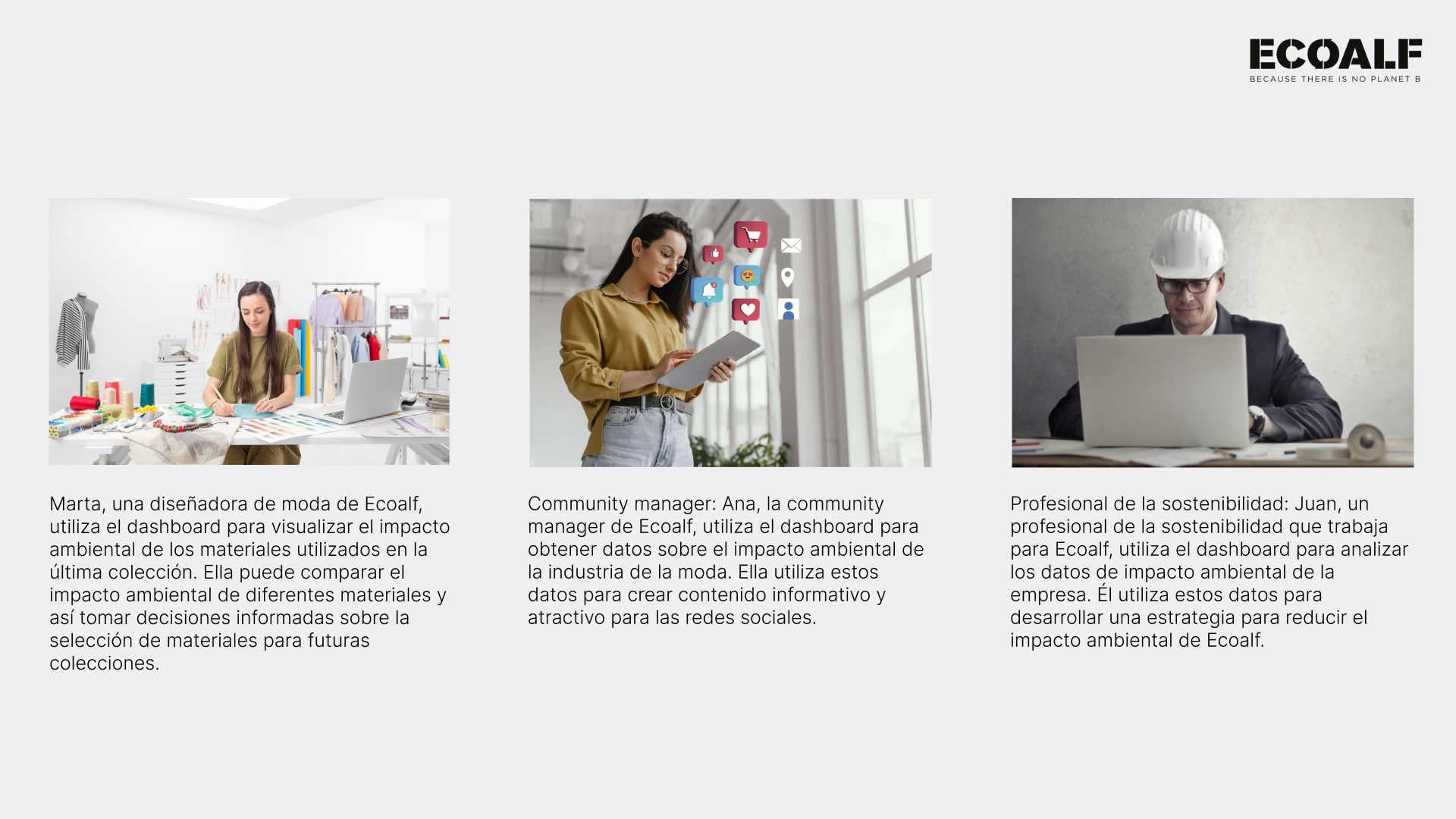
User personas
DESIGN PROPOSAL
The home page displays global data on production traceability and work history.
Home page
In the metrics menu, a new tab was added with ICSA information, where users can view detailed data on the proposed indicators, their analysis, and the index generated across different company projects.
New Tab
The dashboard addresses the needs of the three identified users:
1. Offering product analysis lists, historical data, and trends
2. Providing real-time information and detailed comparisons with visual elements
Product detail
3. Detailing the materials used in each project, scored according to the ICSA, and offering the option to share and save materials for future collections
Cards were created to list the materials used in each project, allowing continuous access to reuse them in future collections. The system enables users to save high-scoring or most useful materials and share them with their team, fostering communication and collaboration.
All information analyzed in these tabs can be downloaded and shared, allowing professionals to manipulate the data and collaborate with different departments involved in production processes.
UI TIME
In terms of UI, a minimalist aesthetic was maintained, consistent with BCome’s brand identity. Some existing elements were retained on the screens to avoid disrupting established workflows. Additionally, colors were used to visually emphasize key indicators, considering the symbolic use of colors — for example, green for better environmental performance and red for lower performance or a warning.
CONCLUSION
The goal of implementing this solution is to provide professionals using the platform with precise, easy-to-understand visual information. This allows for the use of historical data, content creation, and information storage and analysis for future projects.
The ICSA offers a comprehensive measure of environmental impact by combining several key indicators. By following these steps to normalize, weigh, and combine data, companies can gain a clear and actionable view of their sustainability performance, enabling them to make informed decisions for continuous improvement.
Finally, the design adapts aesthetically and visually to BCome’s style, maintaining visual and functional consistency with the brand identity.
NEXT STEPS
Conduct usability tests with professionals using the proposed data
Analyze the usefulness of the new ICSA index for them
Continue developing the product-related data section
LEARNINGS
Every project teaches you something new, and although I did not get the position, I wanted to write this case study.
Thinking outside the box in this case helped me discover a new index to facilitate communication and comprehension for the tool’s users, making the data more visual and easier to interpret.
I wish you a happy day, and thanks for reading! Hugs!


